Andium is a NYC based technology startup providing a complete solution for building Internet of Things products.
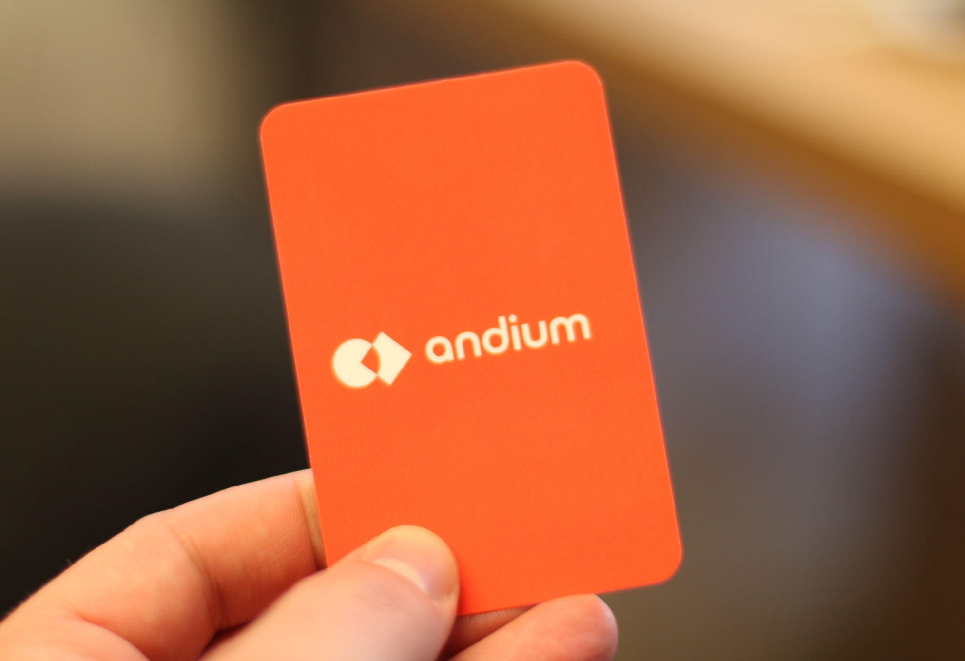
The logo mark is made up of two geometric shapes. The circle represents a network or internet and a rotated square, or a diamond, represents things. Their overlap symbolises the essence of Andium – providing an integrated platform for Internet of Things development. I also like to think that the logo mark can be read as “Internet of Things” too.
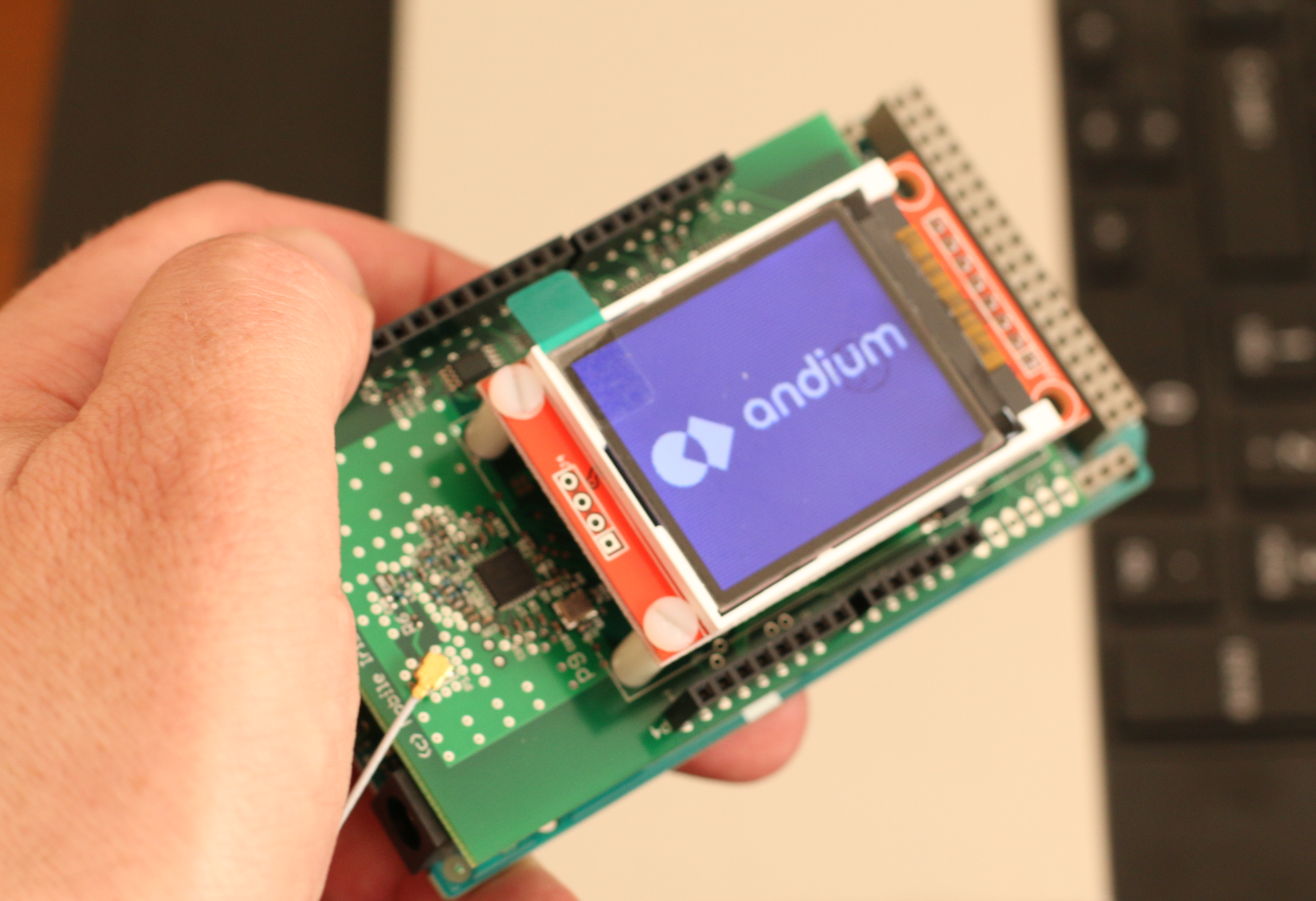
I’ve designed the visual identity as well as the website. Below are a few samples of the signature, visual language and diagrams & icons.